
Ideal Image Size in WordPress Themes Slider
About our wordpress themes’ slider, “What ideal size should my WordPress images be?” It’s always a tricky question to answer, because it really depends on how you plan to use the slider. But here’s some information that should help you decide what WordPress image sizes are best:
1. Very large image = large file size = long loading times. Keep your WordPress images “web friendly”.
This means images that are below 1920×1200 in size, and use Photoshop’s “Save for Web” option to reduce file size as much as possible without sacrificing image quality.
2. Don’t use images larger than they need to be.
If you’re using “Auto Responsive”, and the slider is placed inside a boxed container within your site, and the slider’s width never increases larger than 1200px, your picture image’s original width should be no larger than 1200px.
3. Best images will always scale based on the slider’s “Grid Width” and “Grid Height” ratio.
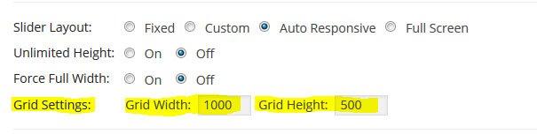
If our slider will never scale past 1200px, as shown in #2 above, here’s the mathematical equation for how best images will be resized:
Image Width = Slider Width Image Height = Grid Height * (Slider Width / Grid Width)
Based on the above equation, if your slider’s actual width is 1200px (the width of the slider when displayed on your web page), with an ideal image size of 1000×500, and a “Grid Width” and “Grid Height” of 1000×500, the image would be resized to 1200×600.
A common question once WordPress image sizes are adjust is: “Why are my images being cropped and some portions of the image can’t be seen?” The answer is based on the math equation above. Unless the image’s original size is equal the slider’s “Grid Width” and “Grid Height”, the image will need to be stretched and cropped. To avoid this, set your slider’s “Grid Width” and “Grid Height” to equal the exact size of your image’s original size.
4.There is no concept of “per inch” in a web layout.
So PPI (pixels per inch) and DPI (dots per inch) are not relevant when editing your photos for your blog, even though they may be available as options in your software. The 3 images below are saved at different PPIs, but you can see there is no difference in picture quality!
An image at 600 pixels wide by 400 pixels in height will have the same file size regardless of what the PPI is set to. This ideal image will have 240000 pixels of information, and that’s what determines the file size. However, an image at 800×600 will have a larger file size than one at 600×400. Because it contains 480000 pixels of information. Since the larger image contains more data and the file is larger, this will slow down your page load time. The 3 WordPress image sizes above are all 102 KB.
5.PPI and DPI are not relevant to web displays, but they are important when creating printables.
Images that are meant to be downloaded and printed should be created at 300 PPI. If you download the photos above and try to print them, you’ll see they print at different WordPress image sizes, with the 1000 PPI image printing at under 1 inch wide.
6.Do not scale your photos too small
WordPress themes will try to re-enlarge them for display on your blog, as this will result in pixelation and blurriness.
7.Appropriate way to use the <img> tags to adjust display WordPress image sizes
WordPress stores multiple copies of your uploaded different WordPress image sizes – a thumbnail, a medium copy and a full size copy – and they are different in file size. If you need to display an image at a particular size, pick the smallest copy that is the same or larger than your desired display size, and use the <img> tags to adjust display size. To display an image at 400 pixels wide, use the full size copy and shrink down to fit – do not enlarge the medium copy, as that will result in pixelation or blurriness
8.Make all edits on your original photo
Do this prior to scaling/cropping/compressing so you’re working with all of your data.
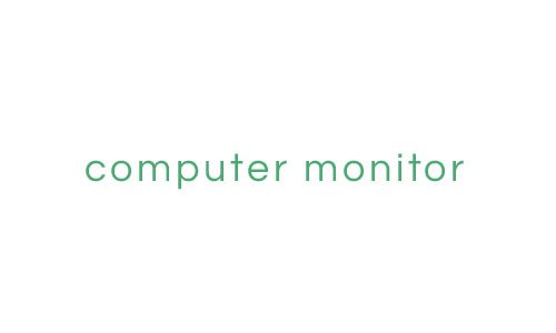
A example for understanding the nature of full-screen images
We’ll pretend the image below is our computer monitor.
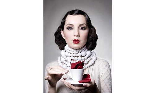
And this is the ideal image we want to use full screen

Problem is, the image of the woman is not the same size as our computer monitor. So what are our options?
Technically we could just resize the image to the same size as our monitor. But because the original image and our monitor are two different size ratios, we’d have to severely distort the image to accomplish this, and it would end up looking like this:

Obviously the above result is a bad solution. How can we avoid image distortion?
One way is to use the “cropping” method. Here’s an example:

The above example covers the entire screen, but as you can see, it also crops, or cuts off a large portion of the image. So how can we display the entire image without distorting it and without cropping it either? By resizing the image so it fills as much of the screen as possible, while making sure no portion of it is cropped. Here’s the result:
As you can see, the above example creates white space on the sides of the image. So how can you display a full-screen image without distorting it, without cropping it, and without creating white space? Technically, you could just make the image the same exact size as your computer monitor. But because there are so many different monitor WordPress image sizes, that isn’t the greatest solution. Instead, you’ll have to decide which one of the above examples is best for your project:
- Distort the image: almost always a bad choice
- Crop the image: a good choice when you want to avoid “white space”
- Fit without cropping: usually creates “white space”, but a good choice when showing the entire image is most important
Thanks for visiting MageeWP WordPress themes. We hope this introduction of WordPress image sizes in thmes can be a reference for you to build your dream website or blog. And we hope you continue to have access to our blog as well as provide support. Many thanks.


