Web Design and Word Press themes
Online entrepreneurship, social media, blogging and the like, are inevitable evolutions of commerce and trade. Creating appealing landing page and effective advertising is essential in gathering a client network. Networking and all forms of internet usage would require competitive marketing if any page or site wishes to remain virtually known. Web designers know the importance of capturing a wide audience and establishing a continuing virtual relationship with its clients as well as potential clients.In attracting a guest a web designer might consider constructing a landing page which is not only appealing but easy to maneuver in.
What exactly is a landing page?
Landing pages are not merely web pages web users come across to when clicking links. A landing page is any web page that requires user information input. Any page that requires email address for usage or subscription is an example of a landing page. It usually comes in a form or with forms to fill out or read. It follows then that not all web pages can be considered as a landing page.
How does a landing page work?
It works by converting a user into a subscriber. It can generate a client network whether it be free or paid. It can be a form of media such as music or video.
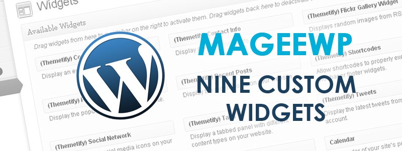
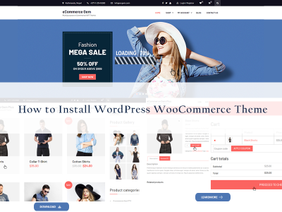
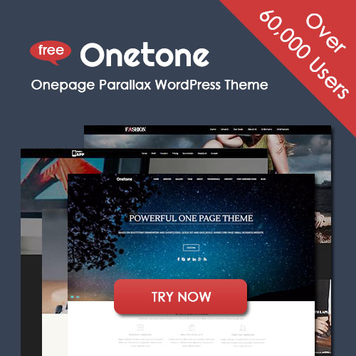
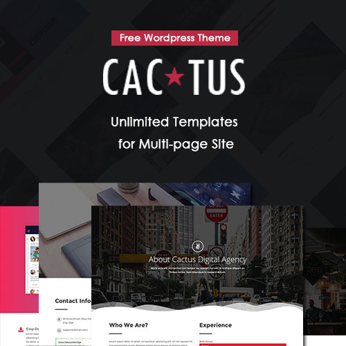
Web design is about creating user-friendly, eye-catching relevant websites. Creating themes with various styles. Horizontal stripe lay-out is one common example of a web page design. It is by far one of the most effective lay-outs and has gained popular use. This is understandable by maintaining a horizontal stripe theme it easy for users to use the interface. It is easy to maneuver around data. In this manner information is organized in a chronological way which is easy to follow and easy on the eyes. There are a number of other types of lay-out. Fixed, fluid, relative, absolute lay-out designs. But the horizontal stripe form makes it easy to process information bit by bit without overwhelming the screen. WordPress themes work in a similar manner. When you read a blog usually it is easier to pick out bloggers using the horizontal stripe than any other lay-out.
Anyone who is familiar with blogging knows the importance of having the right theme with which to represent the blogger’s style and genre. It can get very redundant when themes become stereotypical and repetitive especially when they are under certain formats. But that is a challenge for any designer to work around. Eventually it becomes an interplay of lay out, graphics, color palettes, and font styles. A page, to be effective, must come across as stylish, sophisticated, informative and relevant to the reader. Too much visual can make it look garish or garbled. To keep from the pitfalls of making extravagant themes most designers keep certain aspects of the web page design in muted form. This merely means they pick out which part to enhance and which part to tone down, between graphics and text. Also large chunks of information are kept to a bare minimum and are divided into categories. Such as creating an “about us” or “home” category instead of combining everything on one webpage.